
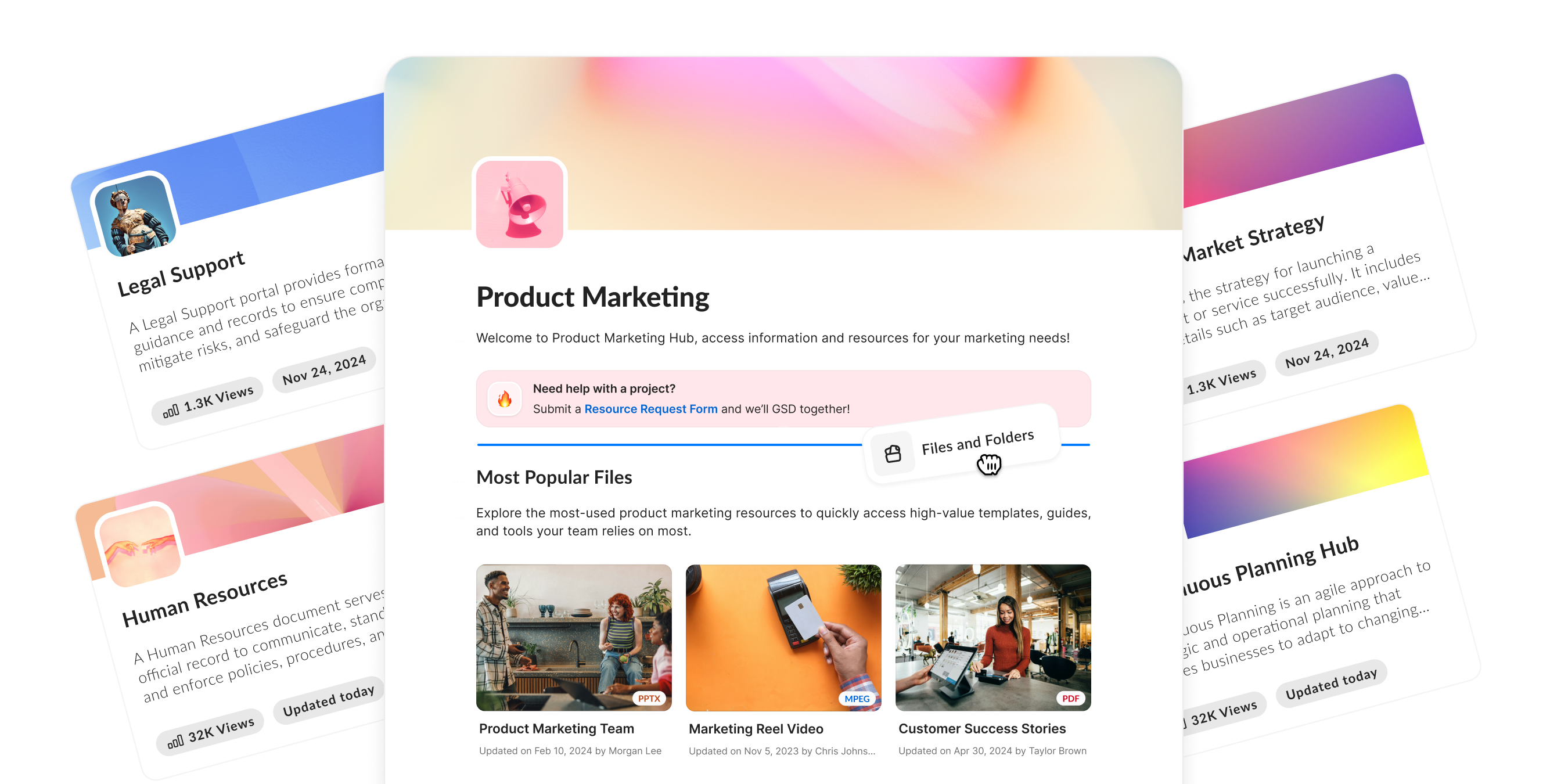

At a Glance
Timeline: 2022 → 2024 (GA)
Team: PM, Eng Lead, 8 Engineers
Role: Lead Product Designer
I joined Box Hubs after initial research and a handful of conceptual mocks existed—but the product direction was still highly ambiguous. My role was to take scattered insights and incomplete ideas and turn them into a coherent, scalable product. Over two years, I led the end-to-end design of Hubs: information architecture, creation workflows, builder model, search, and hierarchical page structure.
Case Study Context
As customer use of Box grew, so did the amount of content teams needed to manage. Box, however, lacked a simple way to bring scattered information together, and share it with a clear topical purpose.
Many customers turned to SharePoint or custom websites, which were expensive, hard to build and maintain. Hubs set out to provide a simple, secure, no‑code way to build curated content experiences on top of Box.
Because the product is large and multi-faceted, this case study focuses on three pillars that represented the biggest customer needs and design challenges—each directly grounded in early customer insights.
- Builder: addressing the difficulty teams faced building and maintaining SharePoint sites.
- Search: solving low relevance and poor discoverability in existing enterprise search tools.
- Pages: simplifying navigation and structure, a major pain point of deeply nested sites.
Outcomes
Hubs was one of the most anticipated releases at BoxWorks 2024, and adoption reflected that excitement. In the first 90 days, nearly 2,000 customers enabled Hubs, a number that grew to more than 5,000 by the end of the first year. User engagement scaled rapidly as well, with monthly active users increasing more than tenfold (10x) from launch through year one.
As one of the few Box products built from the ground up (0→1). Hubs has quickly become a core part of the platform and an important driver of enterprise sales. With the help of Box AI, Hubs has become a powerhouse that allows users to find answers quickly among hundreds of files.
Builder Experience
Problem
The core Hub concepts existed, but there was no real way for users to create or edit a Hub. First, I cleaned up existing screens to match the new design system, then defined the full builder experience from the ground up.
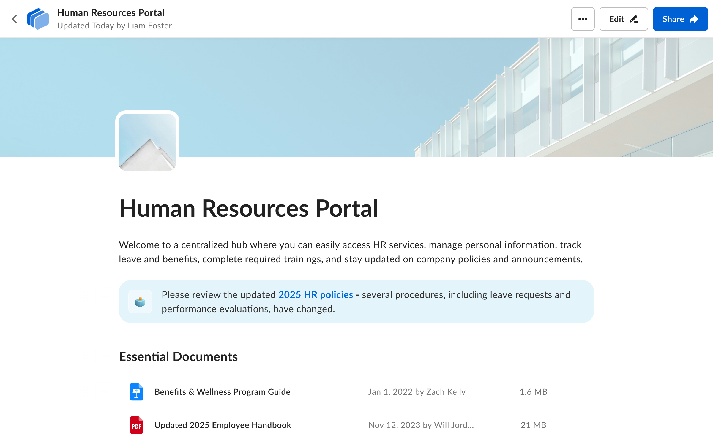
Builder Options
Notion-style builder
Looked familiar but led users to think Hubs was a text editor, blurring the line between Hubs and Notes ❌
Side panel builder
Provided structure but felt heavy for the early, simple set of actions ❌
Inline editing with hover actions
Lightweight, immediate, and WYSIWYG—ideal for MVP ✅
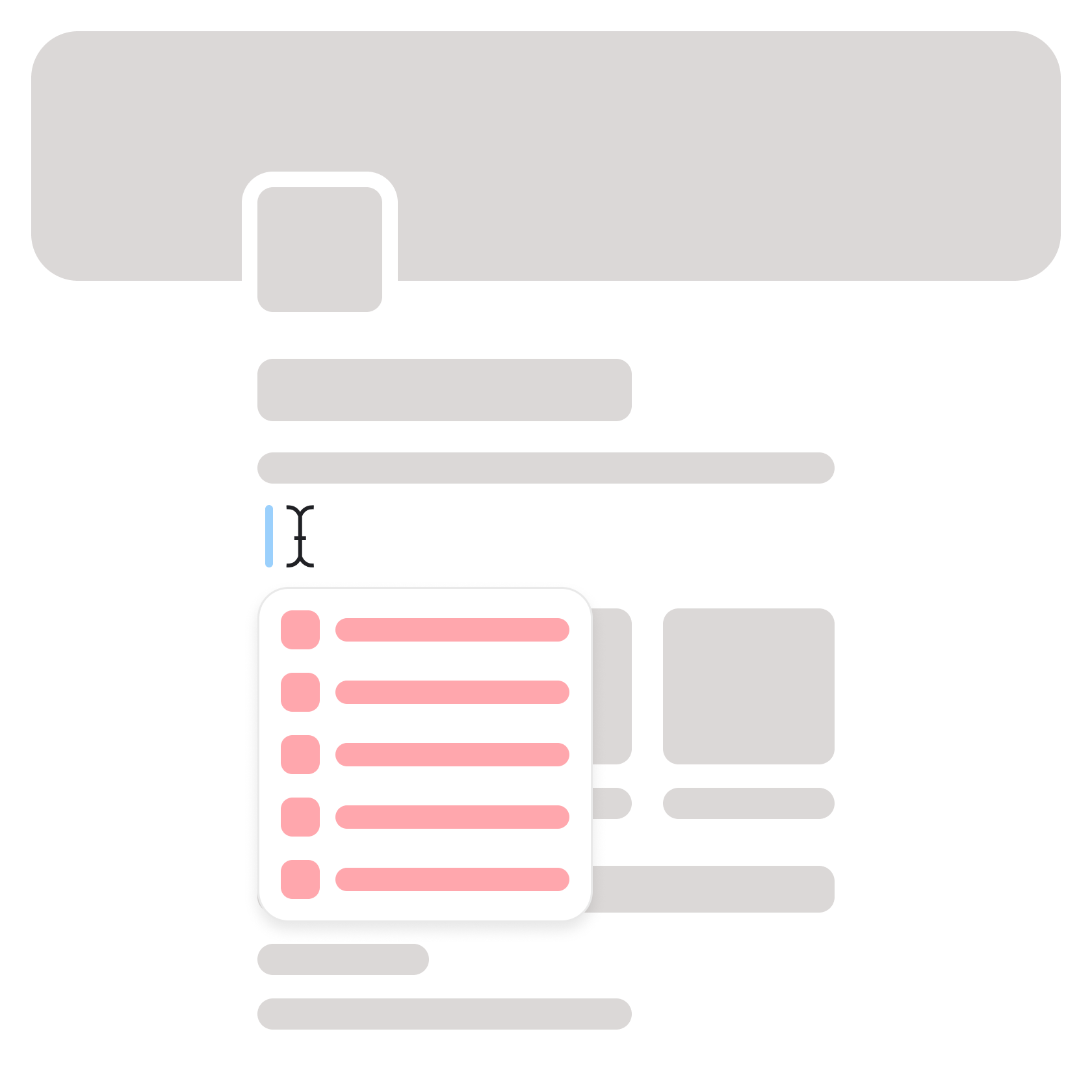
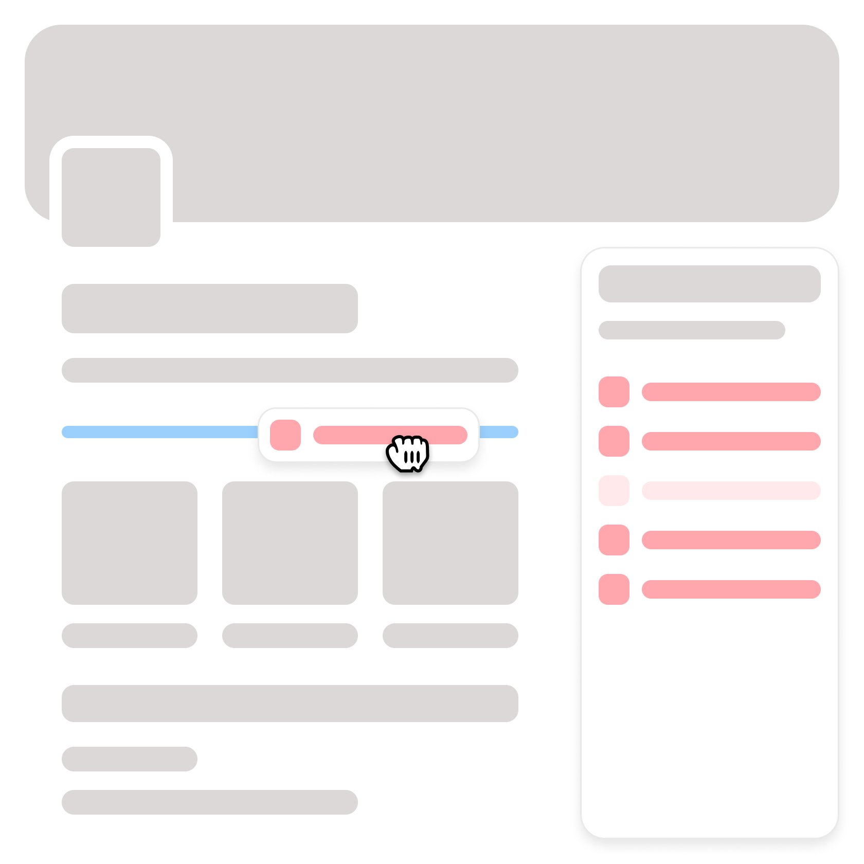

Post BETA Issues
While the option to show actions on hover made sense at the time, real-world usage revealed user frustrations and lack of discoverability.
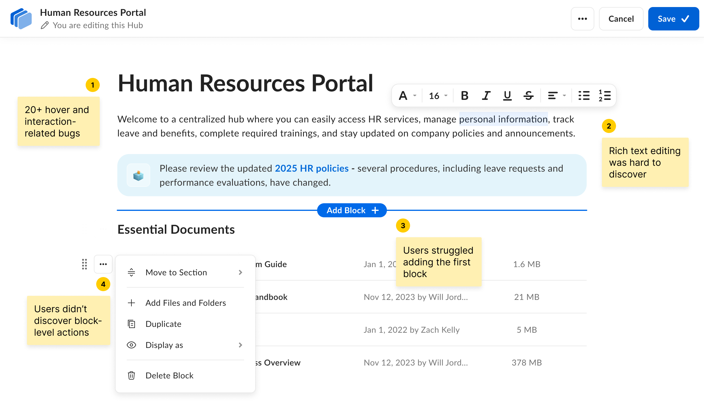
Final Iteration
I revisited the side panel concept and refined it into a simpler, more discoverable builder. With all blocks visible upfront and every action surfaced when a block was selected, users immediately understood what they could do.
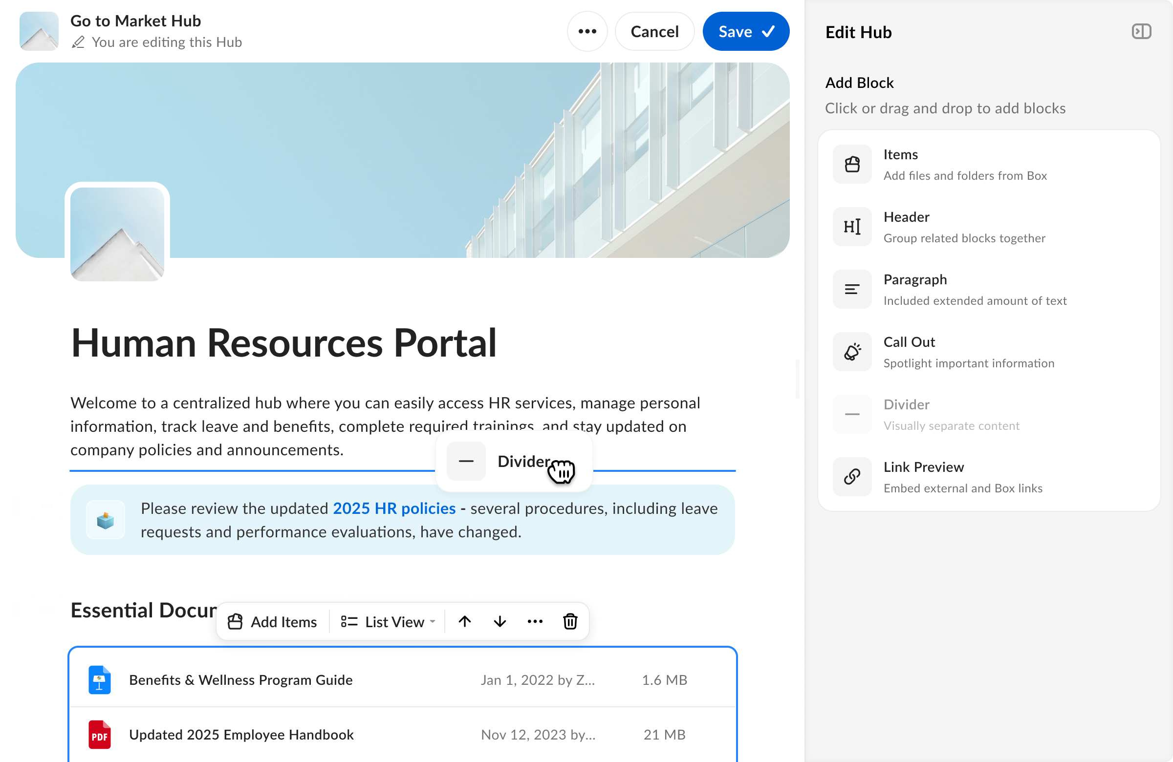
This resolved the hover‑related bugs and delivered a far more predictable editing experience. Customer response was extremely positive.
“I didn't realize how much of a difference being able to just click and add a block would make, but I feel very productive with how quickly it feels to build a Hub.”
Search Experience
Problem
Another issue customers faced was search. They mentioned that SharePoint search often failed to return expected results, while Box had a confusing filtering UI — especially for metadata.
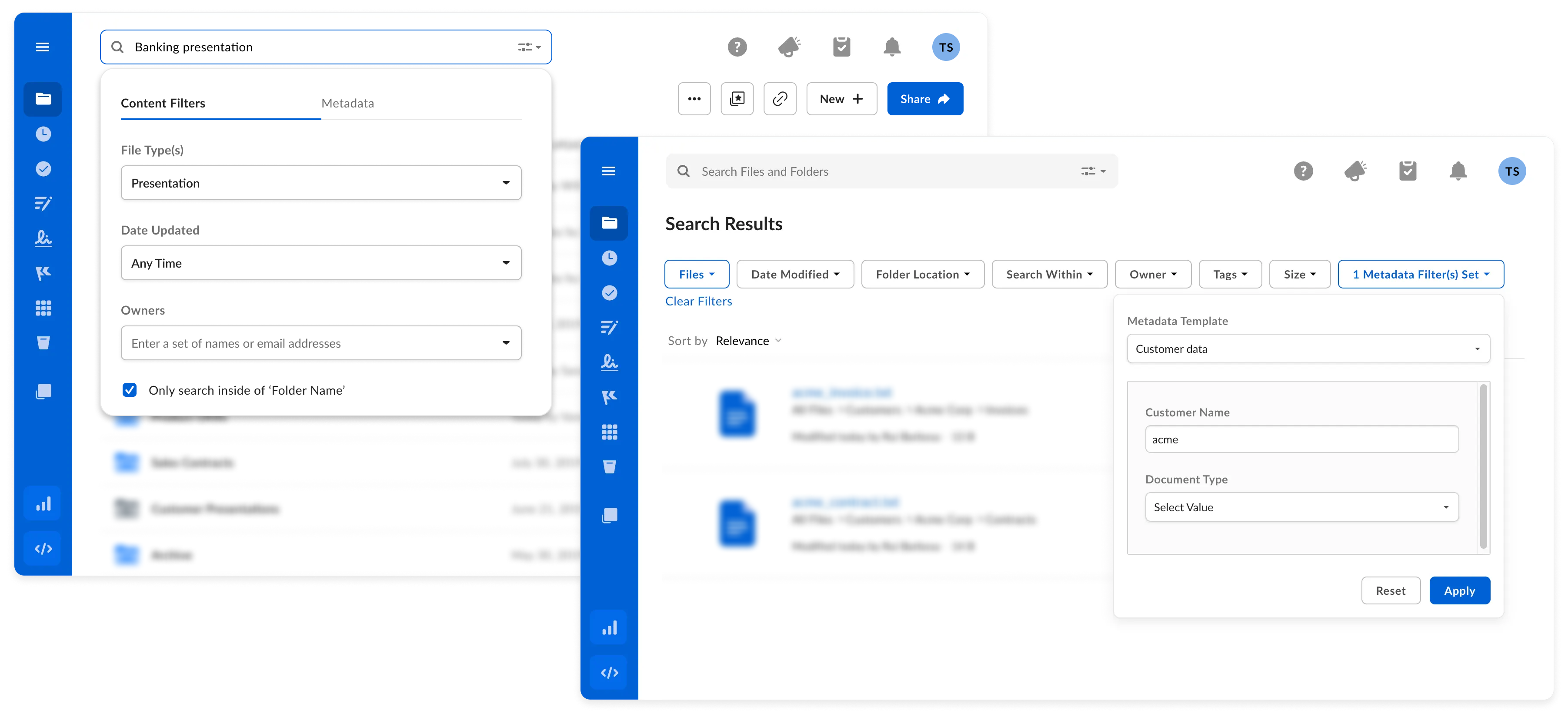
Solution
I introduced a side panel search experience with clearer filter organization. This was later adopted by Box's global Search, indicating strong design alignment.
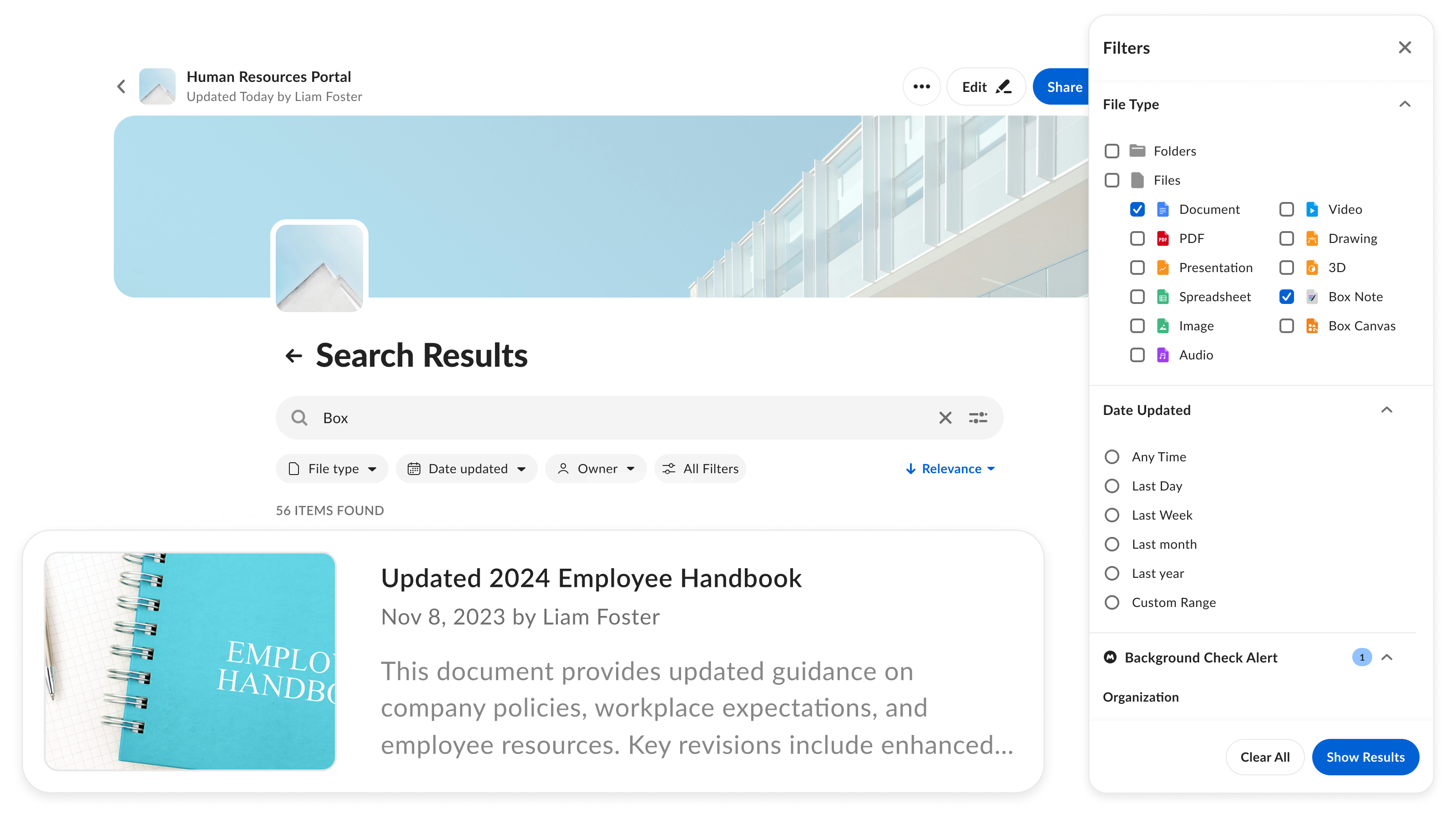
Incorporating Box AI
I also delivered an AI-powered summary panel to allow users get answers quickly. This feature was released internally.
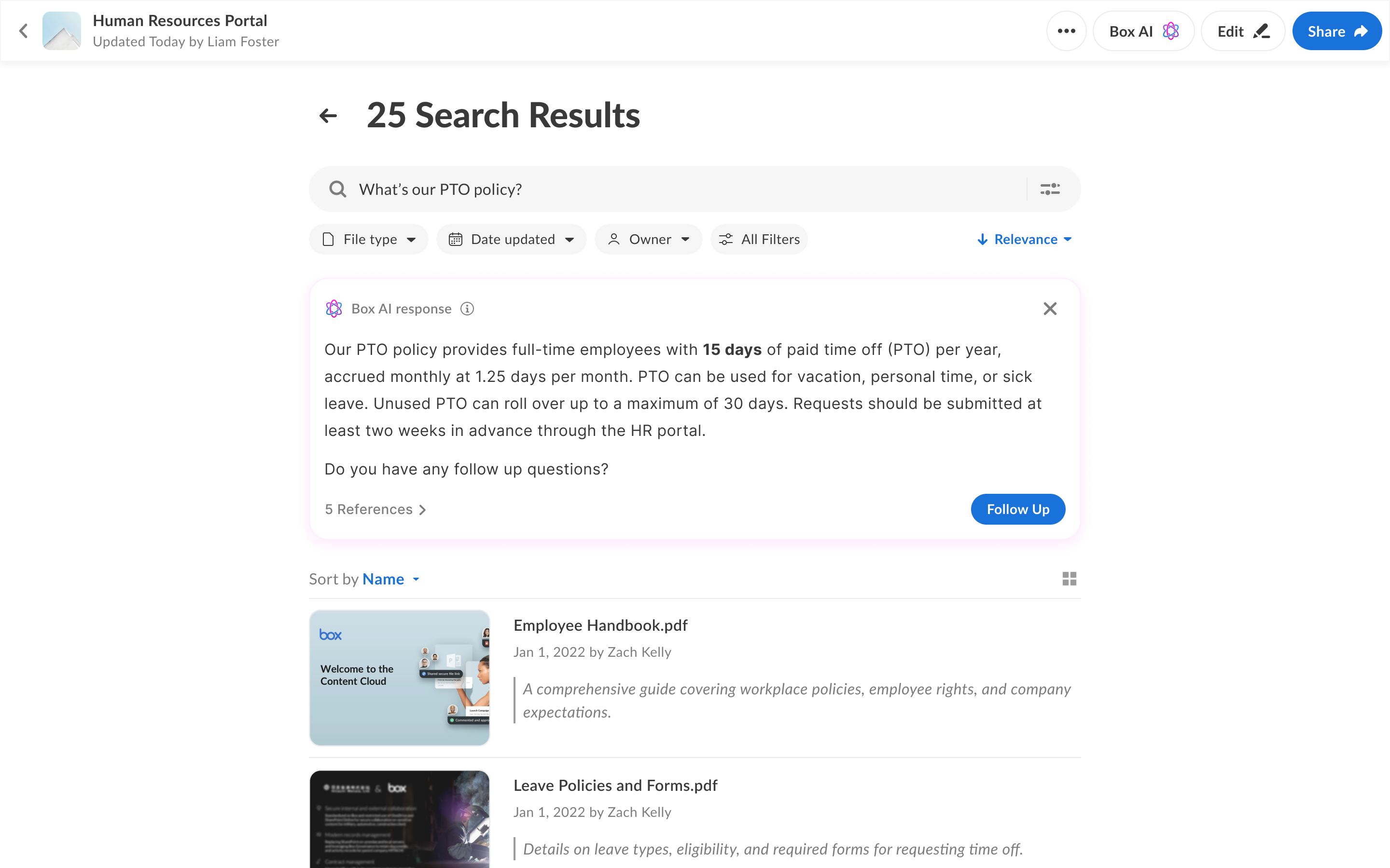
Feedback was conflicting:
Some users appreciated getting combined answers from multiple files, while others found the persistent AI banner distracting when they simply wanted to locate a specific file.
Based on this information it was obvious that the search would have to be redesigned.
Behavioral Insights
I dove into key usage metrics and research insights to guide my decisions regarding search AI redesign.

75% of Box Search queries are 3 words or fewer

More than 60% of Hubs search queries were AI related

Good AI answers often made traditional results irrelevant

More than 50% of Box search results found via quick search

Hubs users searched 4.5× more when AI was available

Context matters and quality citations help build trust
AHA Moment
Search should be AI-first: quick search handles simple queries, and Box AI will handle the rest by returning search results or answers based on user query and context.
New Search Model
Based on this realization, I integrated Box AI within the search flow. Initially I show a user quick search result but on Enter, Box AI evaluates the query and decides whether to surface a direct answer or show search results. Users can seamlessly switch back to the standard results view at any time, maintaining control while benefiting from AI‑powered relevance.
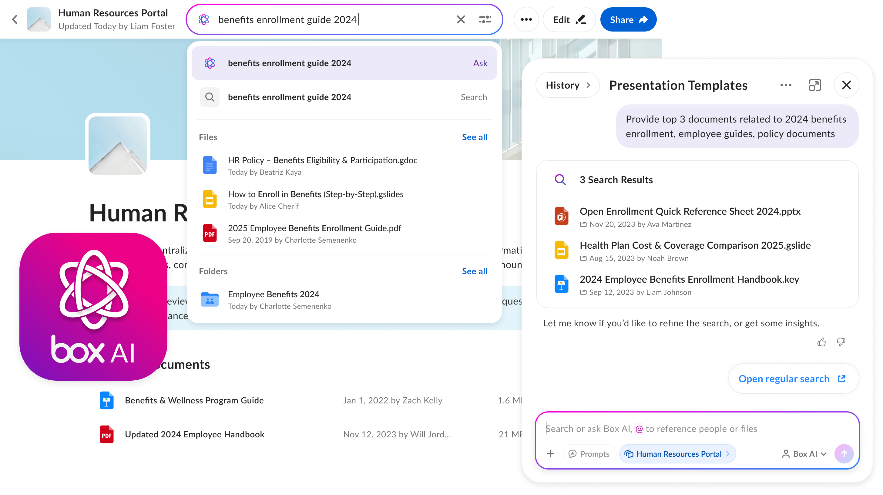
While this feature is only released internally and I'm still gathering feedback the hypothesis is that If AI consistently retrieves relevant content, it can streamline or replace traditional search.
Hubs Hierarchy: Pages
Problem
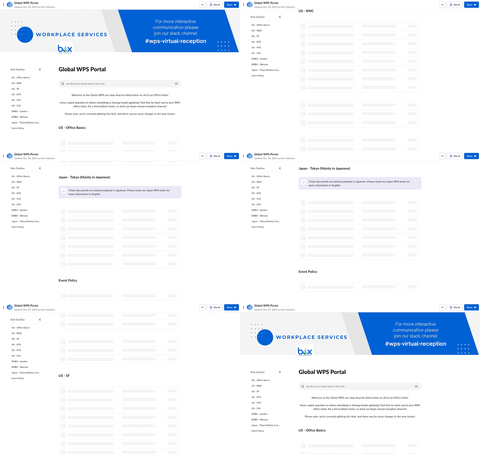
Customers began using Hubs for increasingly complex content structures. One example: Box Workplace Services wanted a single Hub for all office information worldwide—a long page with a multitude of sections.
Solution Exploration
Before exploring solutions, engineering flagged a critical constraint: No matter how deep the structure is, users will always gain access to the entire Hub - not just individual subsections.
To guide explorations, I defined three principles:

New solution can't degrade 1 page experience
Pages should be easy to create and to consume
Make clear that pages are part of the same Hub
With these principles in mind, I tested multiple hierarchical models with more than 50 users to uncover patterns and expectations.
Insights
Anchor Point
Users understand that pages/tabs are part of the same Hub, as long as they have a navigation that acts as an anchor point.
Home Page
Users addressed the starting page of a Hub as a Home page
Scroll First
Majority of users (83%) scrolled through the page before doing any other action regardless of the concept



What was missing?
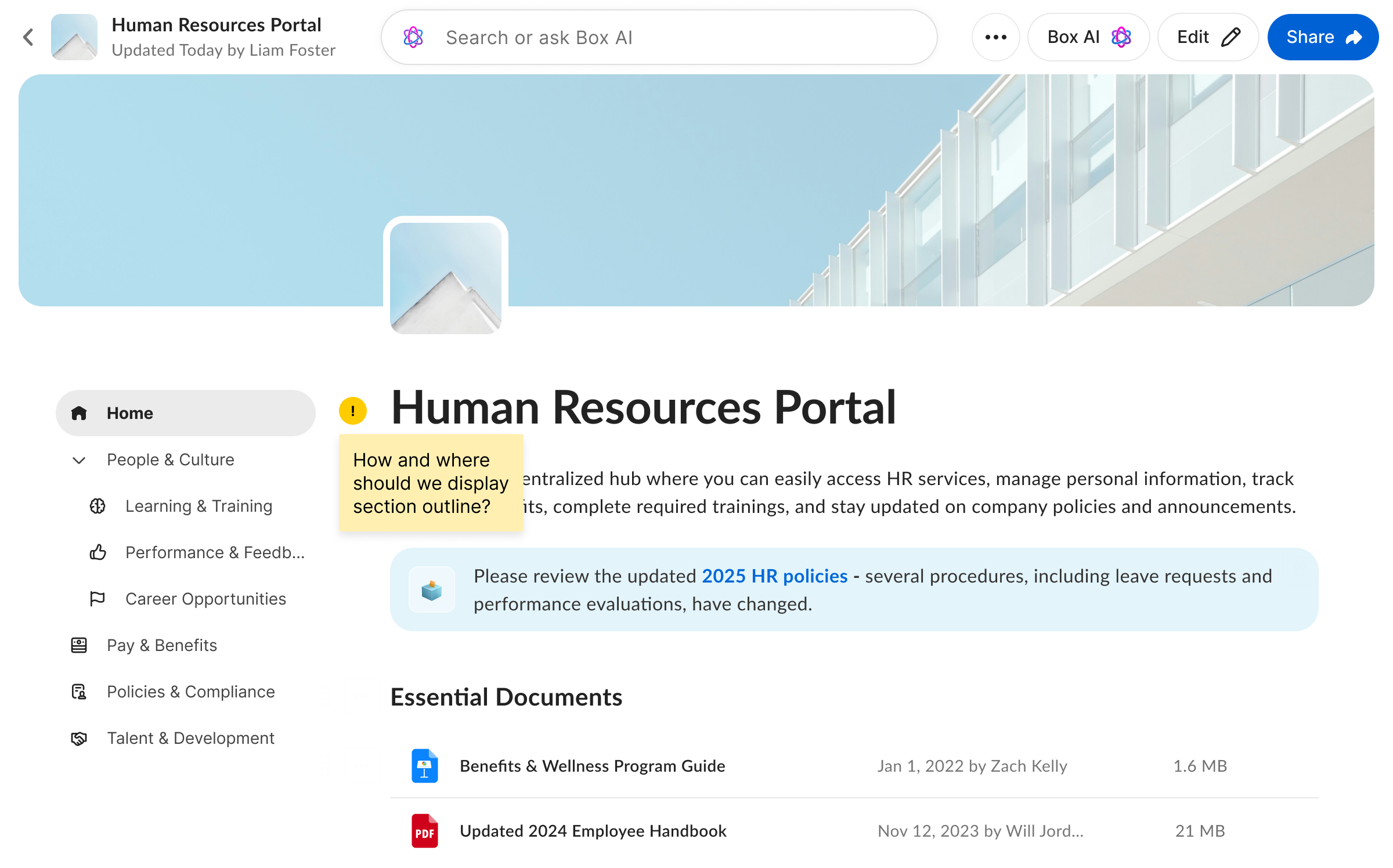
I decided to place the pages on the left side, with the possibility of adding a top option later. However, this decision didn't fully take the existing Section Outline functionality into account. In BETA, Section Outline was adopted by 20% of active users, making it a feature that couldn't be ignored.
Section Outline Options
Two Columns
Having two columns was confusing as pages and section outline were competing with each other without clear hierarchy
Embedded
Embedding section outline within the content worked great but it was stealing a lot of vertical real estate above the "fold"
Merged
While being efficient it was quite overwhelming for the user to understand a merged version of pages and section outline



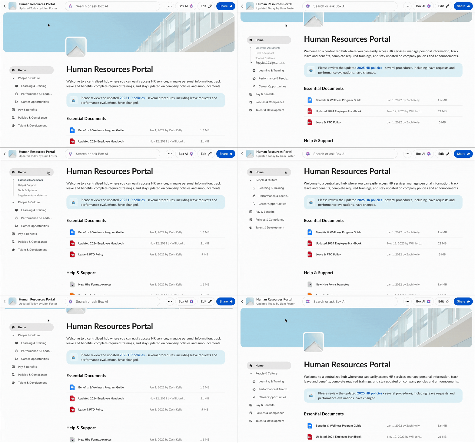
Final Solution
By triggering the outline on scroll, something 83% of users did immediately, I made it discoverable without adding noise on page load. The outline appears only when needed, stays collapsible, and avoids clutter, creating a clean but powerful navigation model for deep Hubs.
Final Thoughts
Summary
Hubs began as an ambiguous idea with scattered research, inconsistent early concepts, and no clear product direction. Over two years, I shaped it into a fully realized 0→1 product used by tens of thousands of people. Through continuous iteration, real‑world feedback, and close collaboration with engineering, Hubs evolved into one of Box's fastest‑growing products and a key differentiator for enterprise customers. It now serves as a simple, secure, and powerful way for organizations to turn scattered content into structured knowledge.